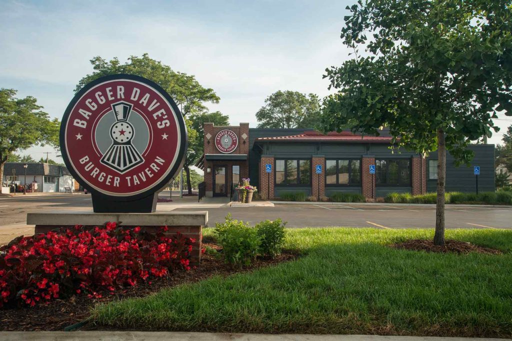
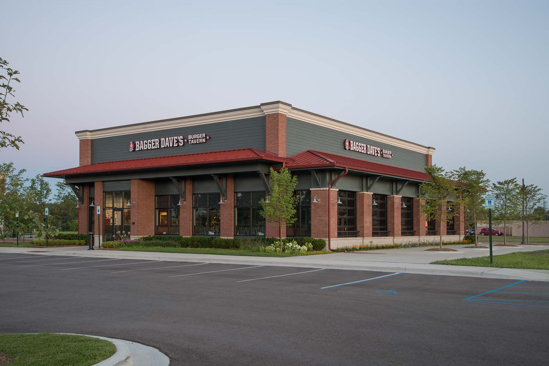
With a growth plan involving the opening of new restaurants across the Midwest, Bagger Dave’s Burger Tavern turned to Ideation Orange to refine the logo design for optimal impact in signage.
![]()
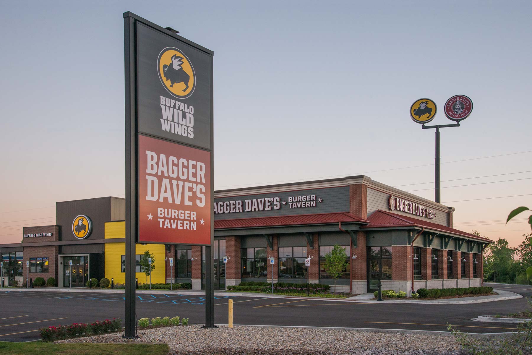
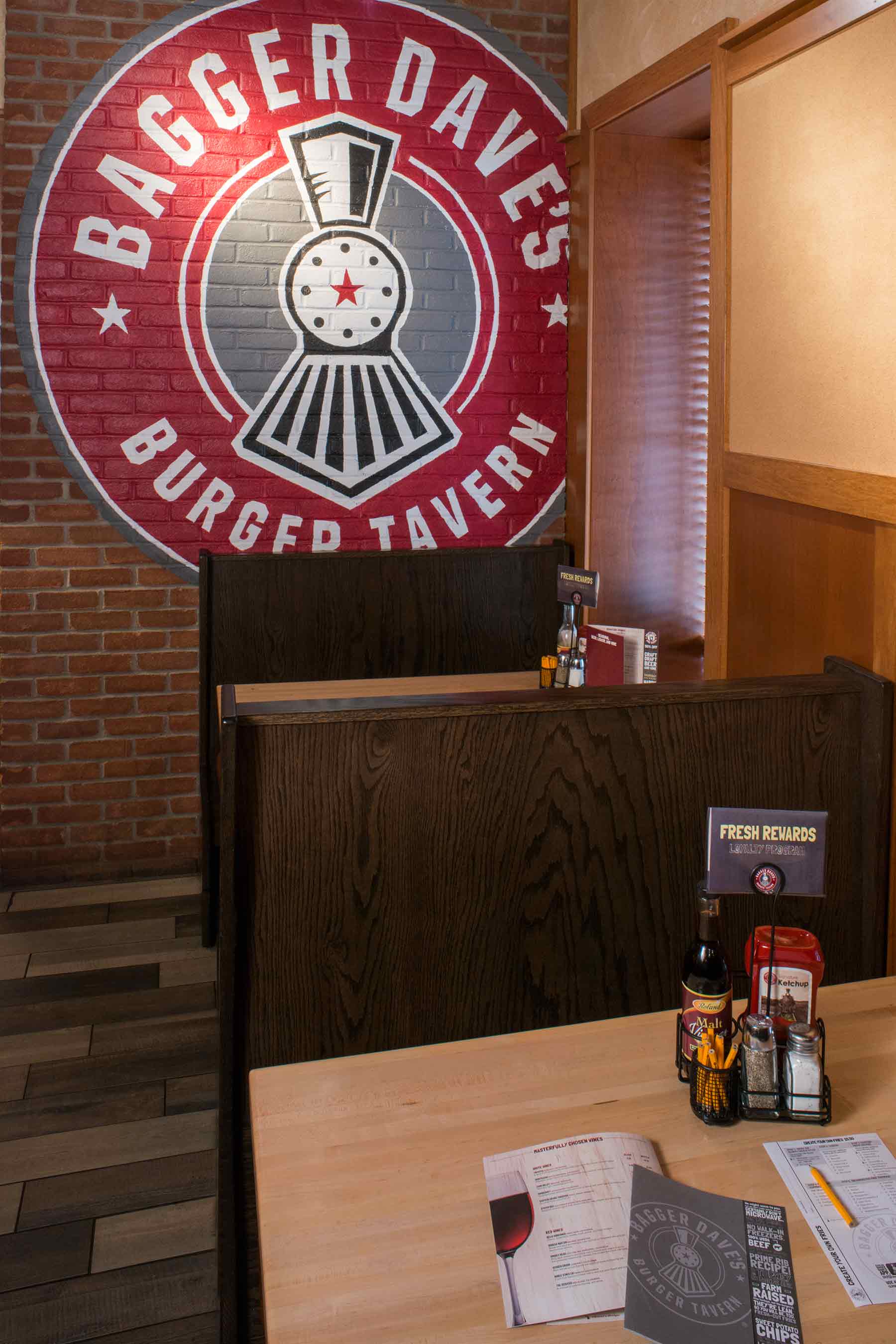
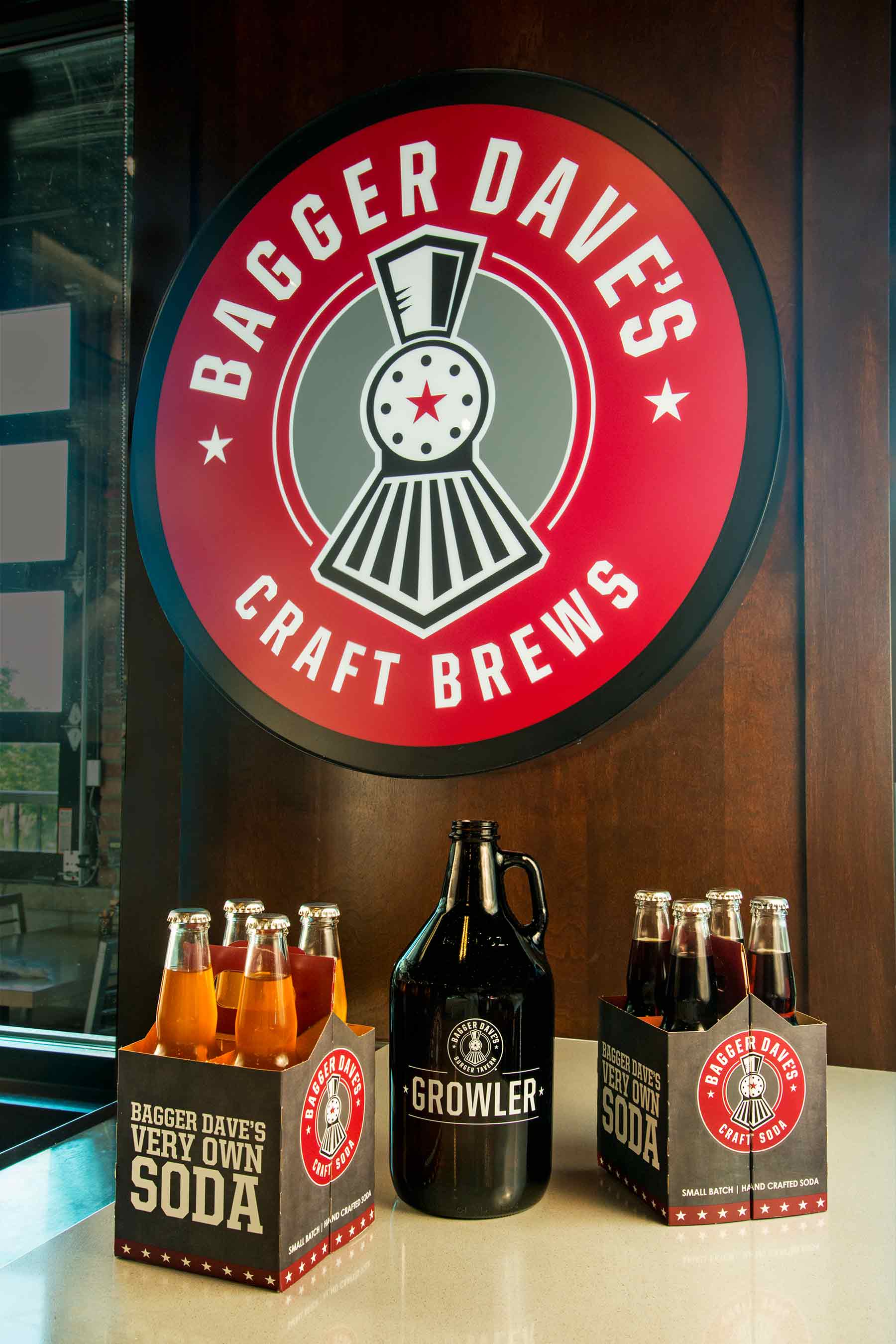
The original logo existed solely in a circular shape. Per Creative Director, Jon Moses, “working together with Krieger Klatt Architecture, we recognized that the logo as a primary façade sign was restricting what could be done with the architecture and also had readability issues when sized to meet city sign allowances. With future restaurants to be opened in both newly constructed standalone buildings and pre-existing buildings and storefronts, a much more expansive identity package was needed to appropriately brand the wide variety of spaces.”
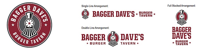
There were also goals of bringing out more of the brand’s personality and introducing a symbol that could be used to support product branding including craft beers and sodas. This was accomplished in an updated logo design incorporating a train, a symbol that has been part of the company’s story and interior design from the very beginning.
![]()
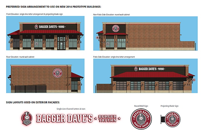
Ideation designer, Michael Garavaglia worked collaboratively with Krieger Klatt Architects, developing and testing concepts of logos and signage in the context of their new standalone restaurant prototype as well as pre-existing buildings.
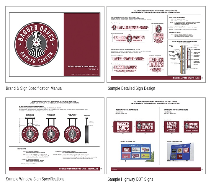
The final brand identity and comprehensive set of over 40 sign designs were packaged in a Brand & Sign Manual that is used to guide appropriate signage usage for new locations.
Photos ©2015 Gene Meadows