Logicalis, a global technology firm contacted us to help tell their story in their office environment. Other goals included:
- Energizing the space and making it feel like Logicalis.
- Tastefully integrating digital displays that would help tell the story.
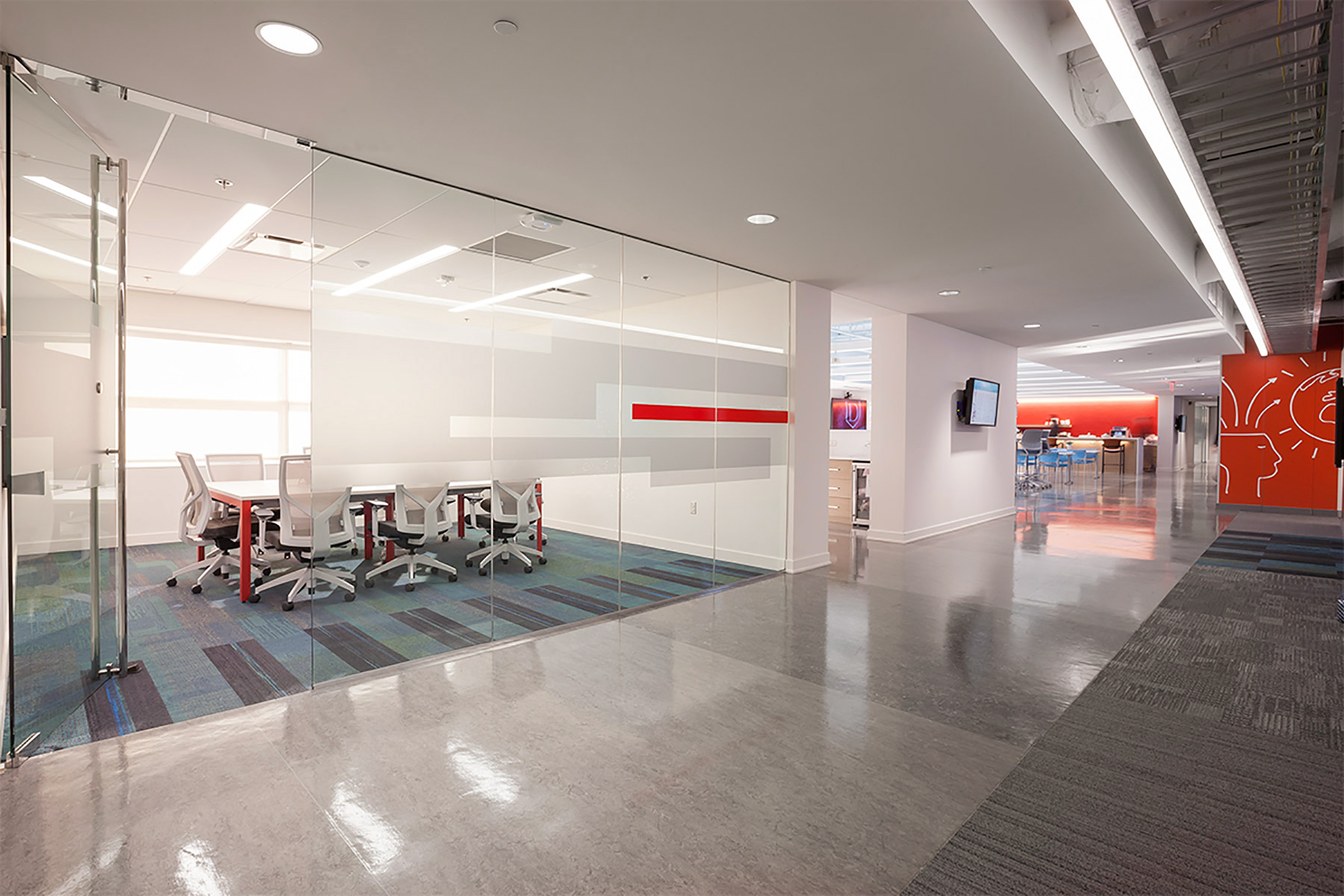
- Bringing more privacy to glass walls of conference rooms and offices.
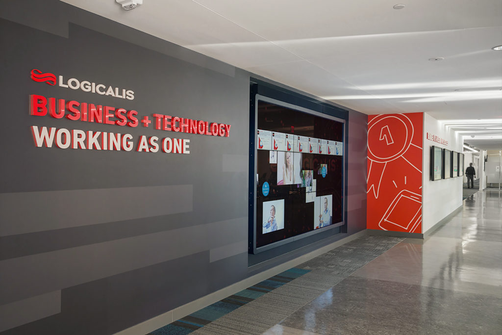
Stories of successful partnerships told with dimensional letters, custom-designed wall paper with pearl finish and digital displays.
For Logicalis, a technology company, telling their story naturally involved an extensive use of interactive touch screens and digital displays.
According to Ideation’s Michelle Lannoo, “Our goal was for the digital displays and the environment to work together. It was important for the walls to be part of the story without stealing attention from the content on the displays. Accordingly, we were very thoughtful about the words, textures and patterns surrounding the displays.”
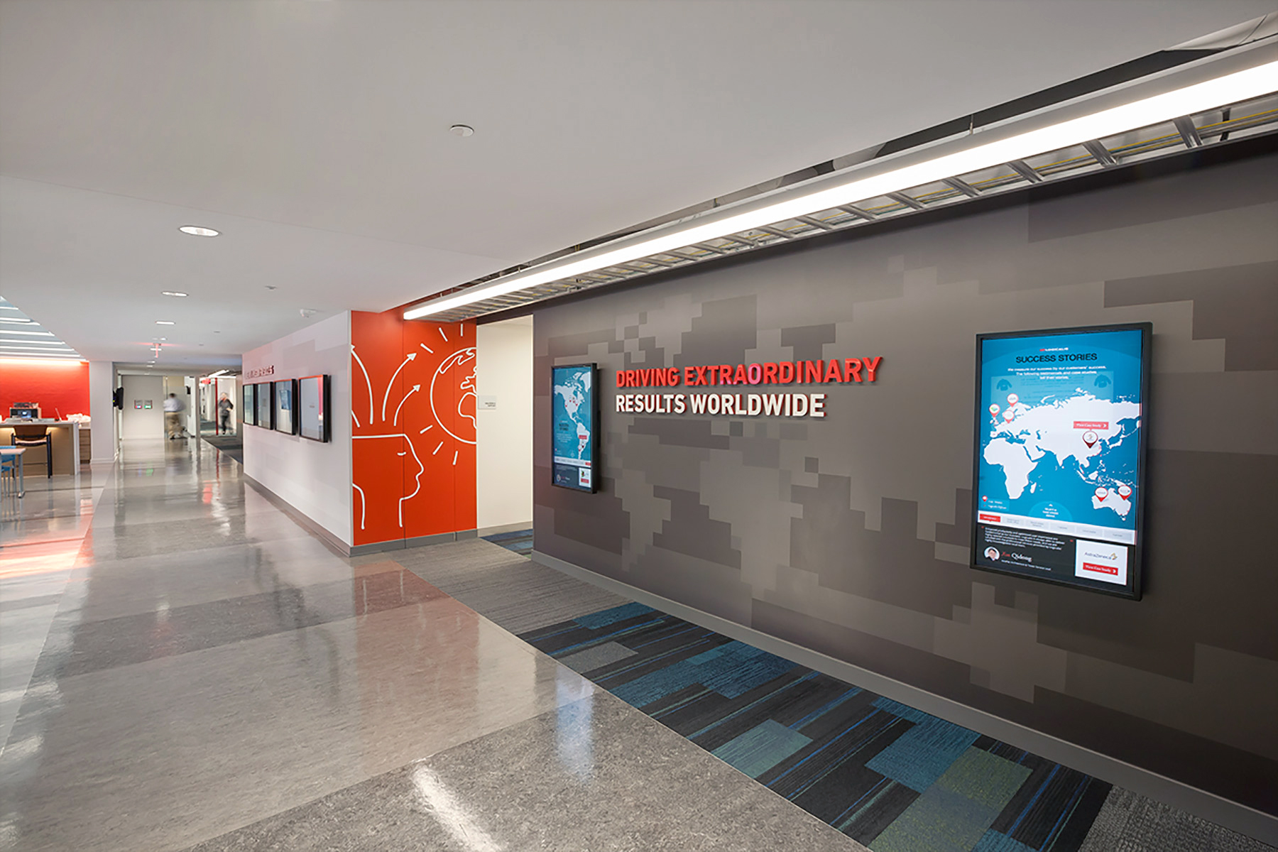
Customer success stories around the globe told with custom-designed wall paper with pique finish, laser cut dimensional letters and interactive displays.
According to Ideation’s Creative Director, Jon Moses, “Once the story was mapped to the wall surfaces and we knew which part of the story needed to be told where we designed a single visual melody that could be used throughout the space to unify the experience. We achieved this with a custom-designed linear bar pattern that took into consideration existing floor patterns and architectural elements. We liked that it also had an analytical feel to it, like blocks of data.”
We then designed variations of this visual melody for specific parts of the story or application. For example, this pattern became an abstract global map on the wall that told the story of the company’s global reach and a multi-layered pattern to increase privacy on glass walls.”
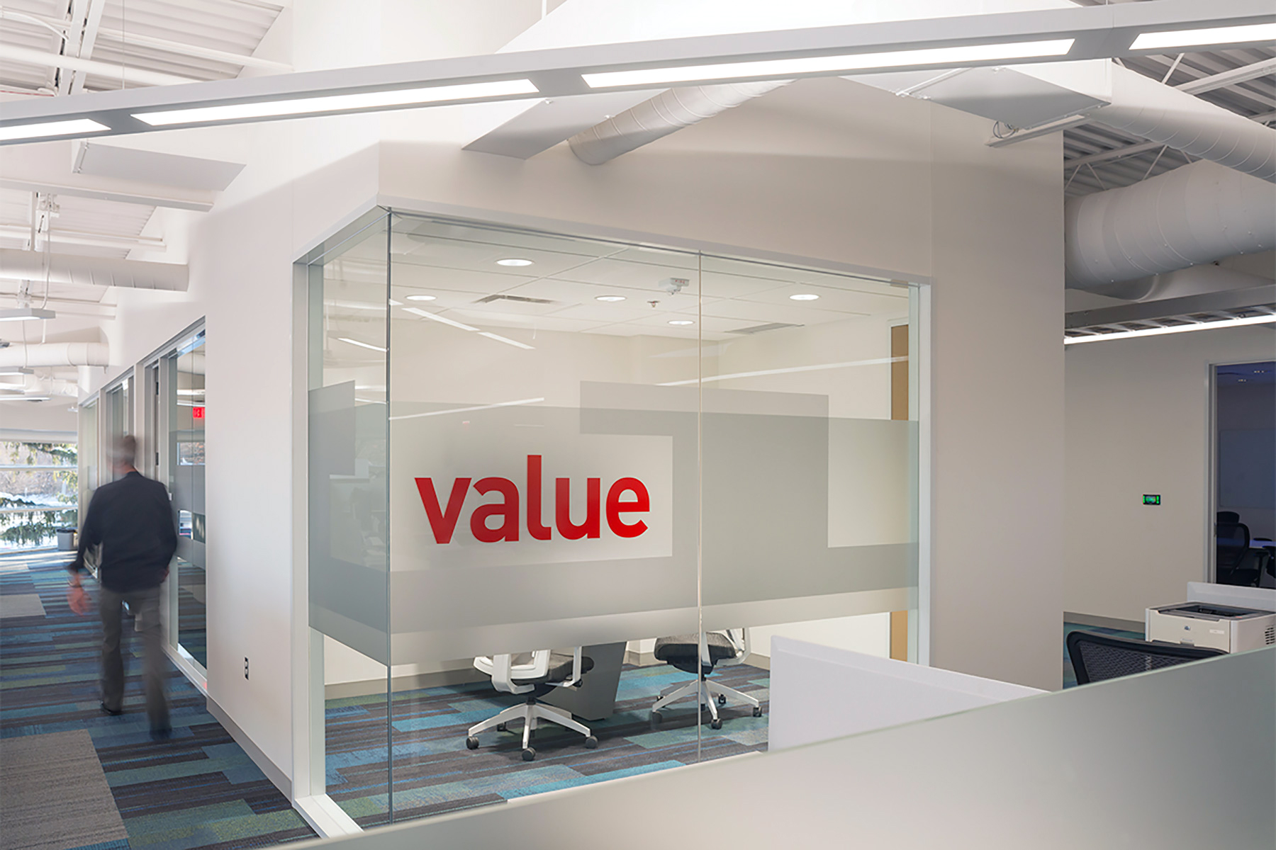
Custom-designed privacy graphic for glass walls from two layers of etched silver and transparent red window films.
Attention was paid to both form and function when it came to increasing the level of privacy on the many glass walls throughout the space. According to Jon Moses, “We wanted the solution to feel like the rest of the space while offering the right balance between privacy and openness. The client loved the glass and wanted a little more privacy but not what they called a ‘shower curtain.'” To solve this, Ideation’s Michelle Lannoo brought a variation of the visual melody to glass with two layers of Oracal 8510 etched silver fine-grain film that was applied to both sides of the glass. A more literal touch of the Logicalis brand was applied with a single bar of transparent red film.
Client confidence in the design was achieved prior to production and installation with full-scale prototypes on 4’ clear acrylic panels that could be positioned in various locations throughout the space to test transparency and the effect of lighting.
According to Michelle, “While the effect may appear random, it is anything but. There is a single base layer of film installed at the width and elevation on all glass walls throughout the office. The second layer of the design extends above and below the base layer. The base layer brought a calm consistency to the design while also simplifying the installation by establishing a consistent baseline.”
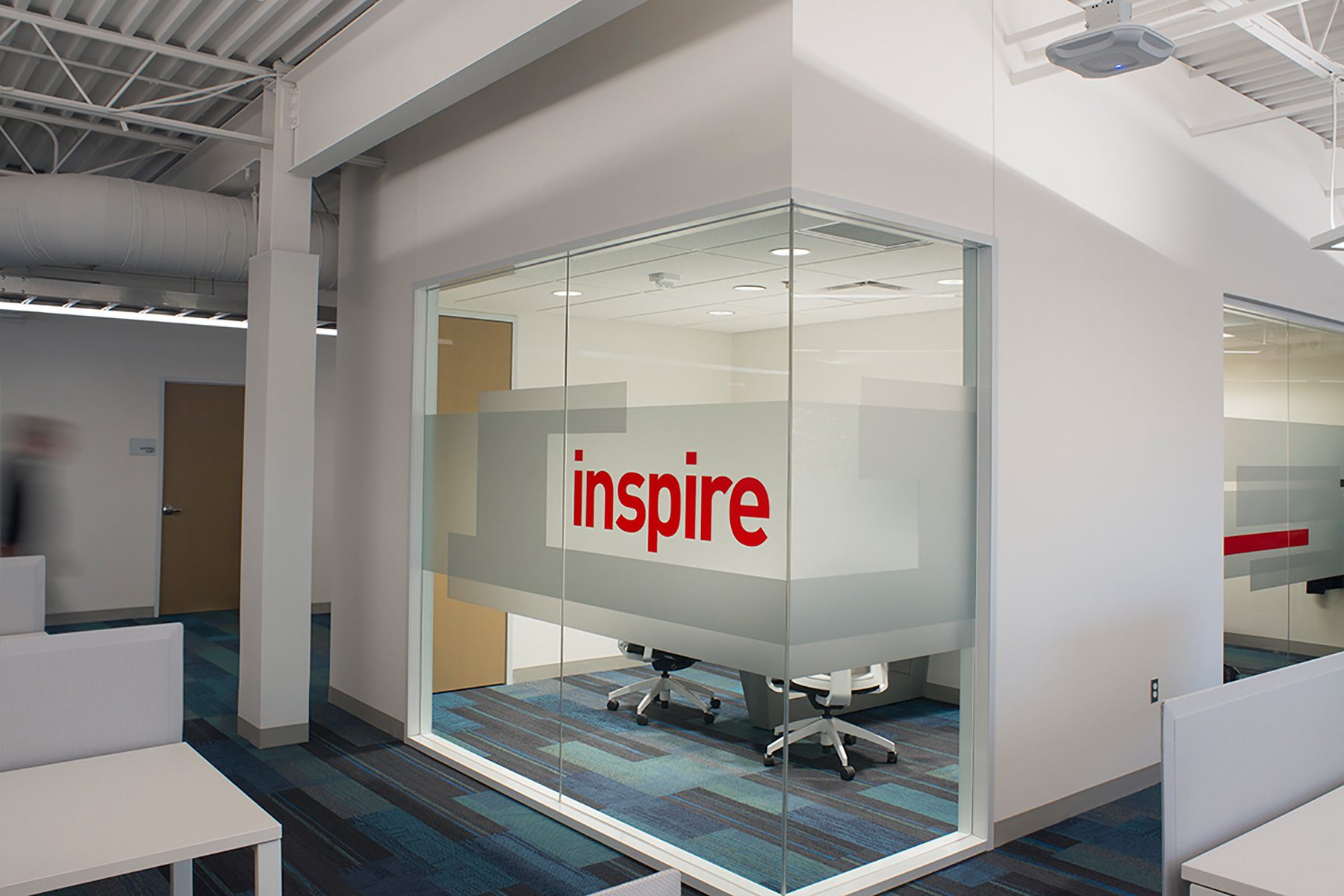
Custom-designed privacy graphic applied to huddle rooms.
The Logicalis team came up with the words to name their huddle rooms. By bringing the names to the glass design, we increased the energy level, made the space feel like them, and told their story more clearly and visibly than with a traditional wall plaque next to the door.
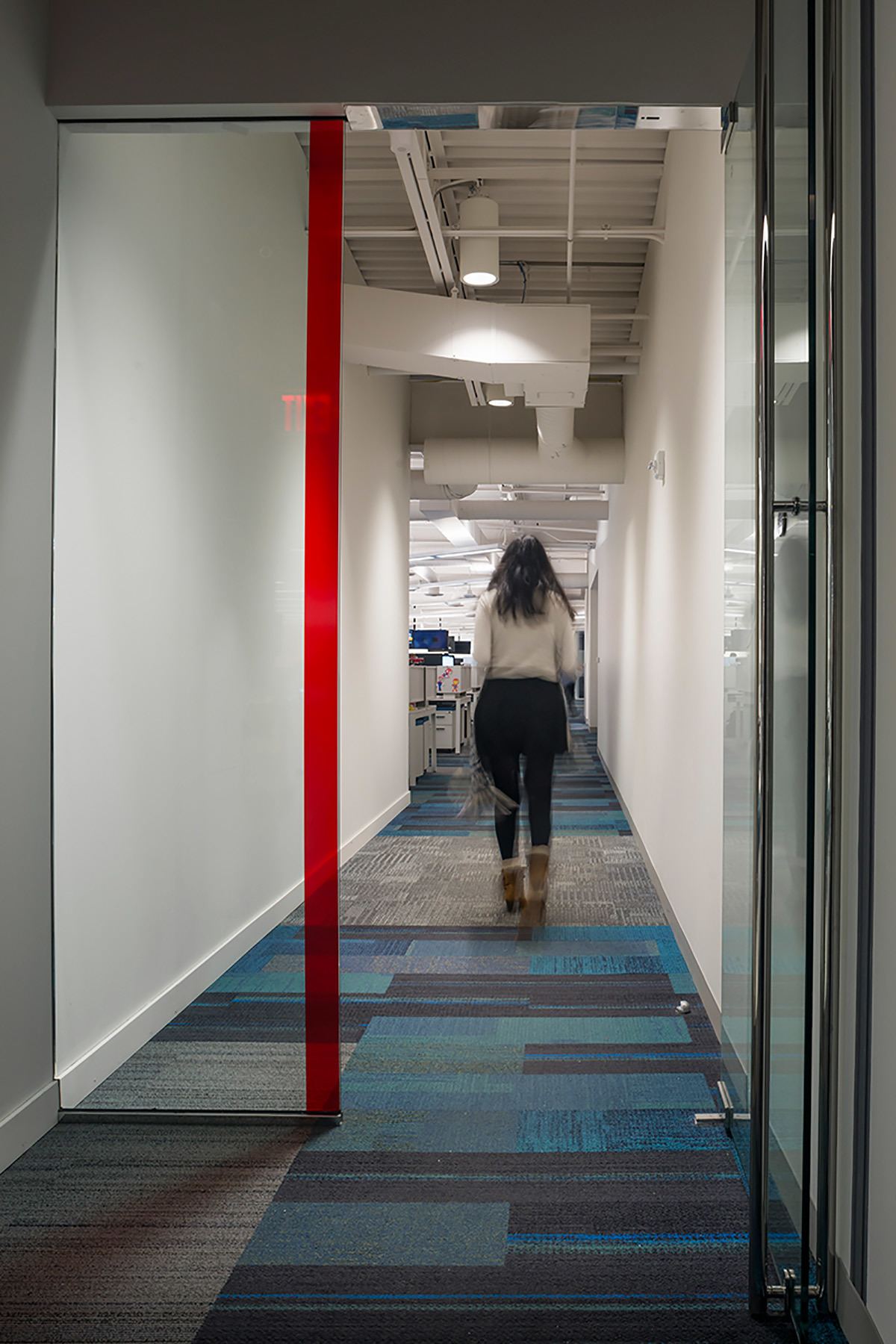
During the discovery phase of the project, it was learned that some of the clear glass walls had also proven to be a safety concern. This was solved with a simple stripe of transparent red film.
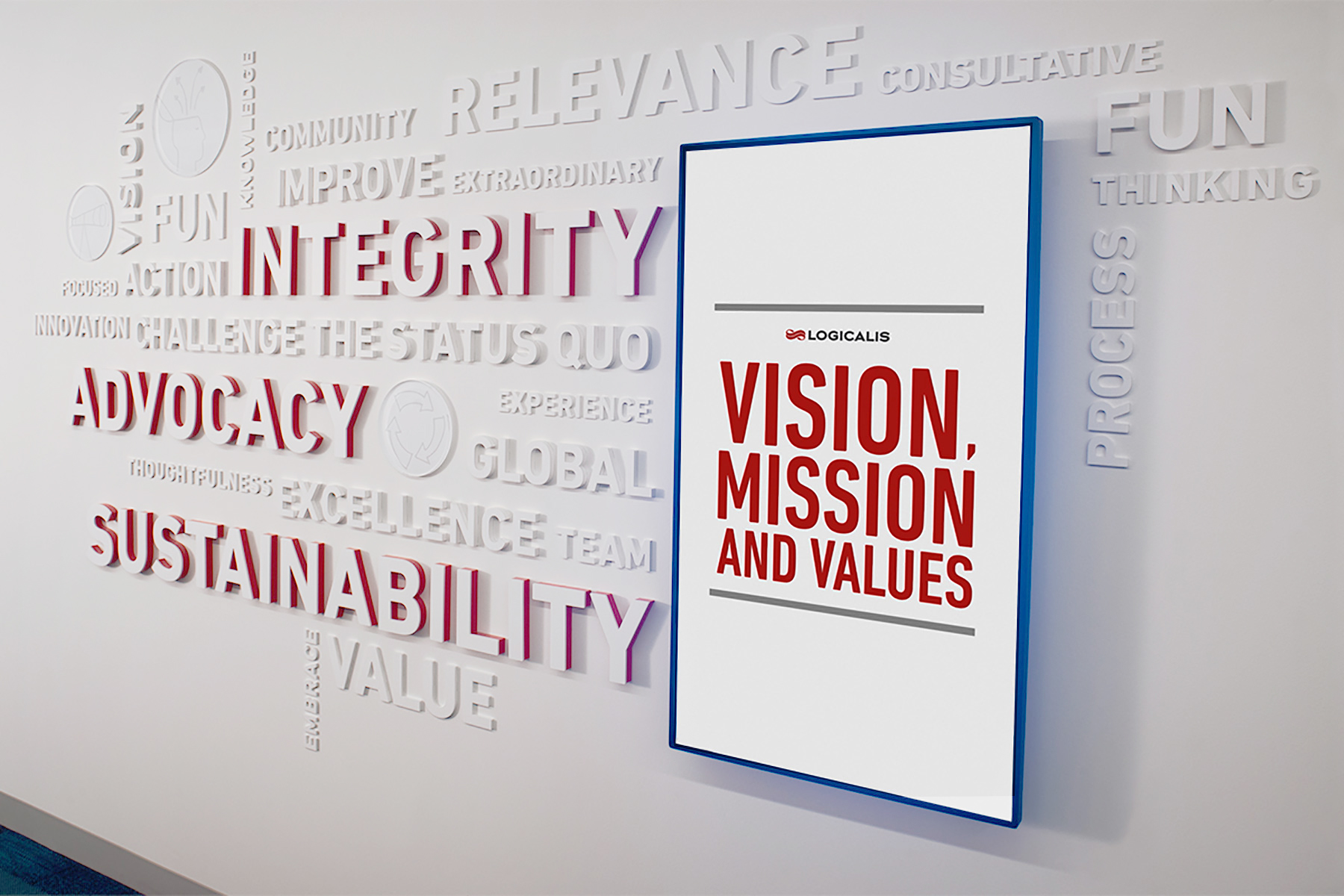
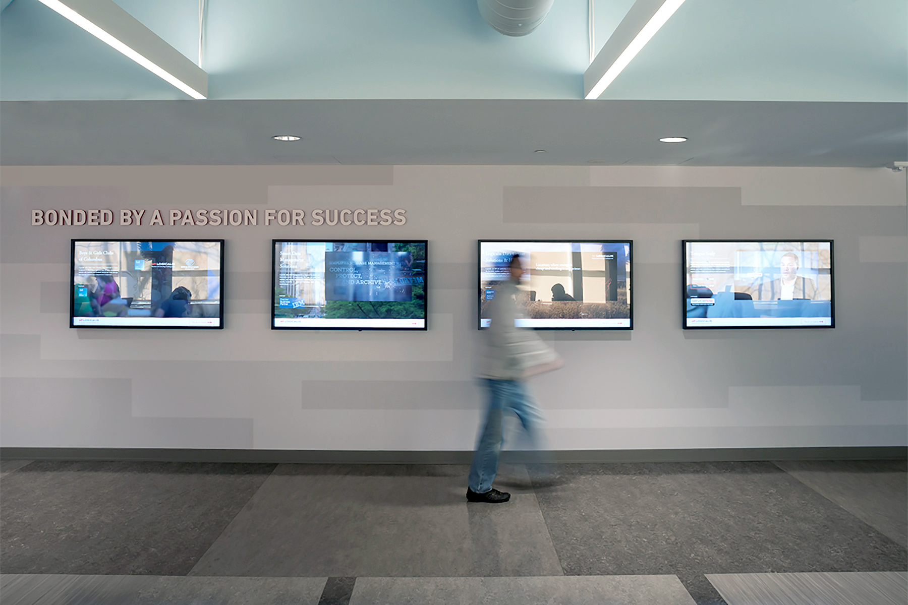
The values of the company were told on two separate walls. While digital display told stories about the values in action, the three core values and other brand words were intended to feel more enduring.
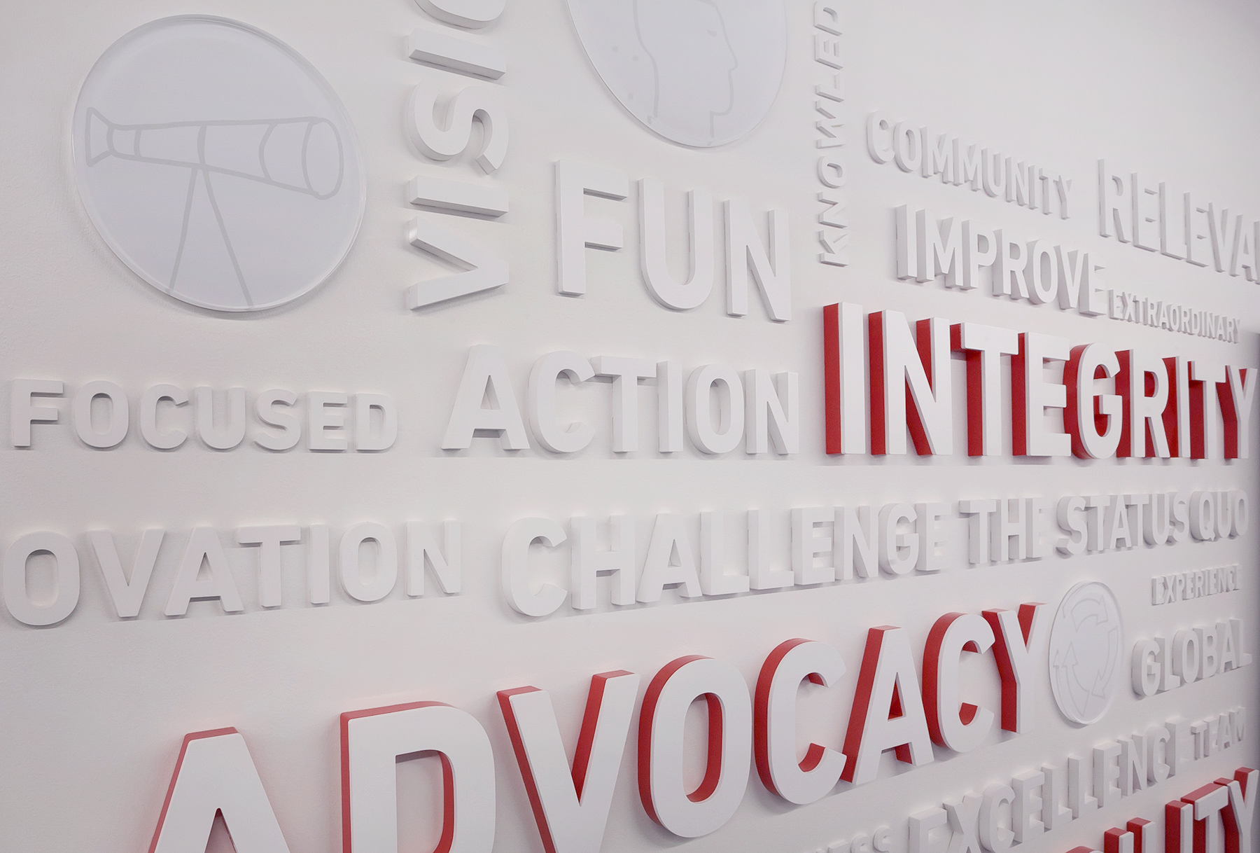
Company values expressed in 376 characters in 4 heights and 3 depths from precision laser-cut acrylic, finished to brand colors.
According to Ideation designer, Michelle Lannoo, “In keeping with our visual melody or theme throughout the space, for this wall, I let the words be the linear block pattern we were used elsewhere. In this application the pattern became 3-dimensional. The 376 letters were produced in 4 different heights and 3 different thicknesses. To bring attention to the 3 core values, we layered the laser-cut letters and made the base layer their glossy red brand color while using a matte white finish on the first layer. By using the same matte finish on the letter surfaces as the wall, it feels like the letters are part of the wall, increasing that sense of permanency.”
Photos © 2016 Gene Meadows