In February of 2013, the City of Royal Oak called us up to come up with a fresh new logo and look for the city. Well, it wasn’t quite that simple (there was a big competitive bidding process that happened first). Now, months later, it’s getting really fun as this new brand starts flexing some muscle around town.
Spreading the Logo Around Town
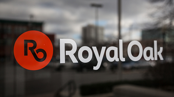
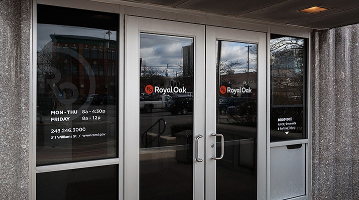
The brand first showed up at the entrances to City Hall with some new vinyl graphics. After the vinyl went up, citizens commented that the doors themselves look new. Nope, just vinyl.
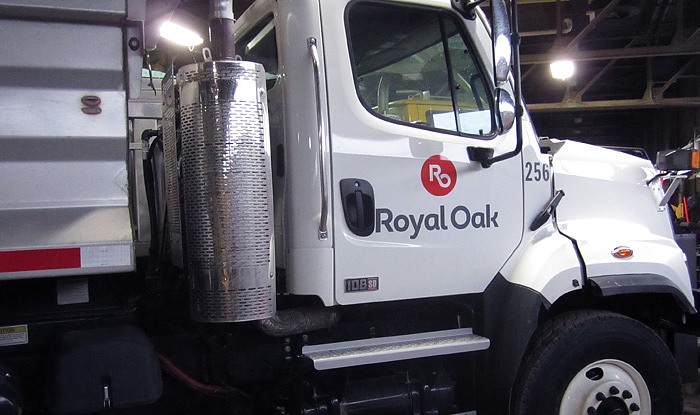
This brand doesn’t just sit around looking pretty. Last week RO brand was spotted getting dirty, clearing the streets of snow and ice. Go RO!
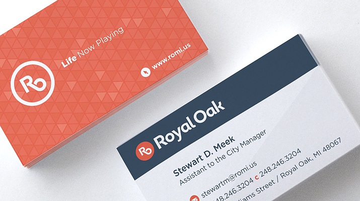
Of course, every brand needs a business card.
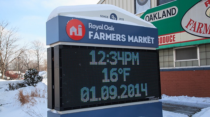
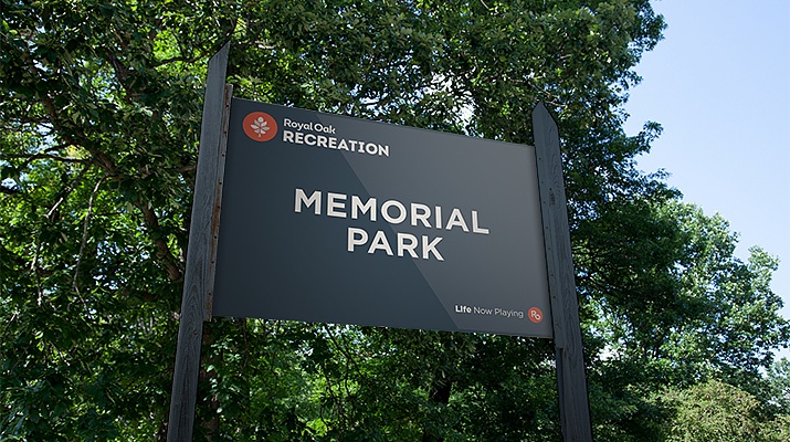
RO brand also lent a hand with new signage at the Farmer’s Market with a design that incorporated the functionality of an electronic message center while respecting the look and feel of the market.
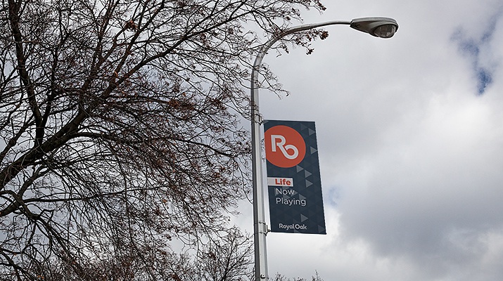
While RO brand hasn’t shown up on street poles yet, it’s ready with something to say.
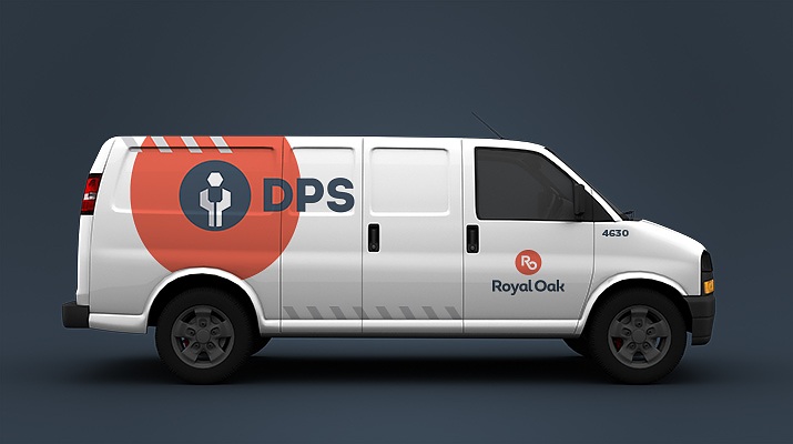
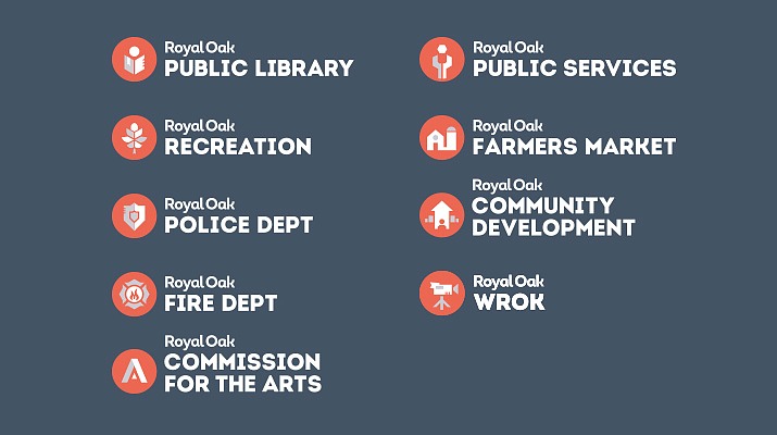
RO brand is proud of its city departments and services and intends to show it. Nine city departments, including the Department of Public Service received their own logos – kind of like RO brand’s kids – can you see the family resemblance?
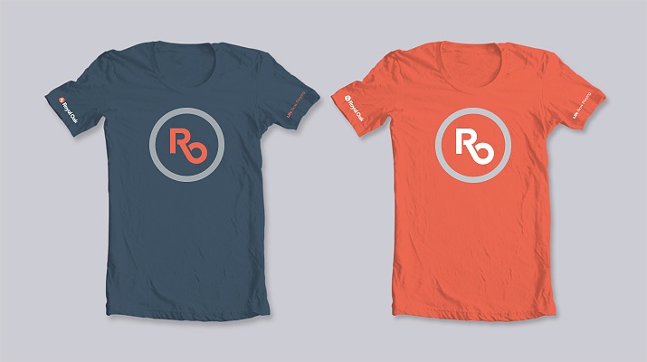
RO brand likes to be worn.
So where did RO brand come from?
Under the direction of Creative Director, Jon Moses, the team at Ideation hit the streets to talk with residents, business owners, city government leaders and city committee members. They spoke with the folks from the RO Historical Society, and some very opinionated people that weren’t even from RO! Along the way, the team brought their cameras to capture what RO was saying for itself.
The logo development recognized that people commonly used“RO” when referring to Royal Oak. It was time to give these letters a rightful place and a good look so that they could stand on their own. An angular line connects the R and the O for a subtle nod to Woodward Avenue, the iconic and historic road that bisects Royal Oak.
The modern and organic type used in the logo brings together the mix of urban downtown and traditional neighborhoods that make up Royal Oak, creating a new urban setting. The sunset-orange and cool-grey color scheme was chosen to reflect the energetic and playful nature of Royal Oak.
“If the new RO brand was given the mic, the message to communicate is Life Now Playing,” said Jon Moses. “For people that define life by what happens outside of work and sleep, Royal Oak is a great place. Whether it’s theater, sports, the zoo, 50+ parks, dining, shopping, or nightlife, it has it all. There’s no greater concentration of this kind of play anywhere else in Metro Detroit.”