Church leadership contacted Ideation to help create a more comfortable guest experience using wayfinding signage that respected the original architecture and more recently updated spaces.
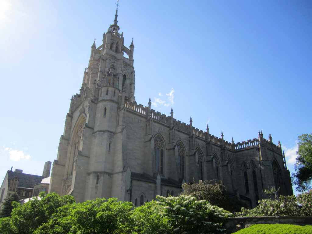
Kirk in the Hills Church (Bloomfield Hills, MI) is of Gothic design and patterned after the famous Melrose Abbey in Scotland that was built in the 13th Century.
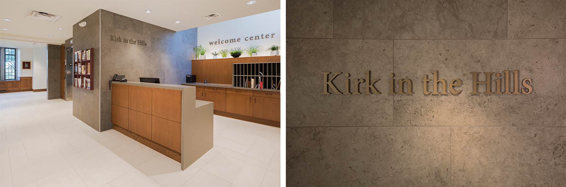
The new welcome center was identified with anodized aluminum letters given a bronze finish. Photos © 2017 Gene Meadows.
A WAYFINDING CHALLENGE: NOT ENOUGH DIRECTIONAL SIGNS
Discussions with team members from Kirk in the Hills identified several challenges affecting the guest experience. One of these challenges was the lack of interior directional signage. Recent changes to how space was being utilized further complicated navigation and was the impetus for the project.
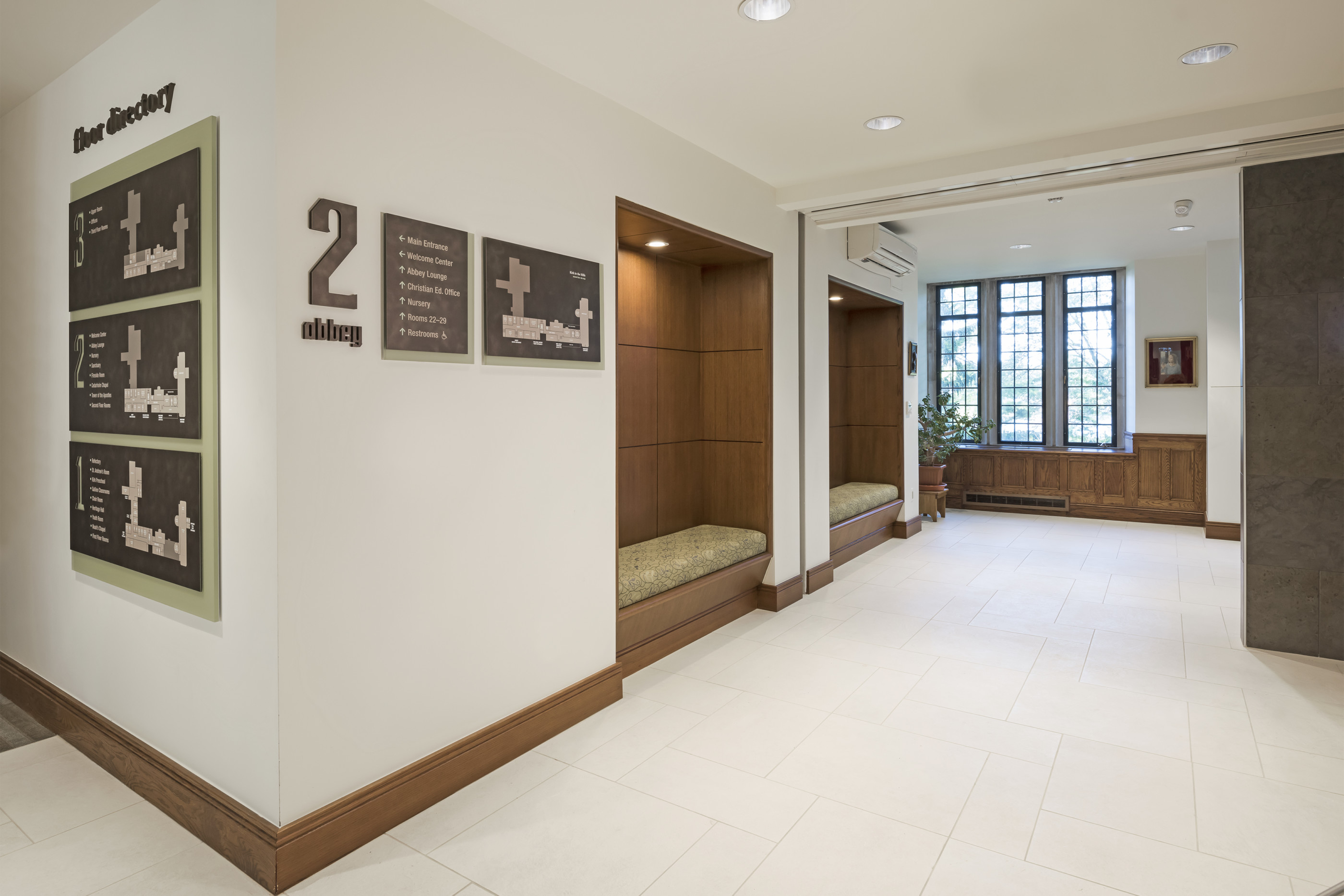
New floor identification and directory signs designed to direct and complement the interior design. Photo © 2017 Gene Meadows.
A WAYFINDING CHALLENGE: UNMARKED ROOMS AND AREAS
Another challenge to a comfortable guest experience was unmarked rooms and common areas. To make matters worse, many of these destinations had taken on different names over the history of the church – the same room was often referred to differently by different people.
This challenge was addressed by defining clear names for each room and area, identifying the area with a sign and referring to it consistently in directional signs and floor maps.
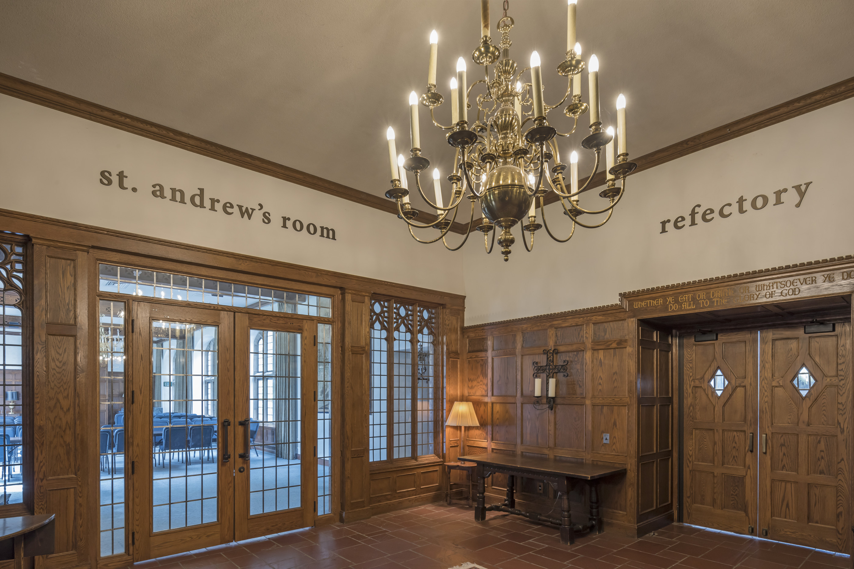
Destinations are now clearly identified with designated room names. Photo © 2017 Gene Meadows.
A WAYFINDING CHALLENGE: YEARS OF SPACE EVOLUTION
The third challenge to a comfortable guest experience was some navigational confusion resulting from multiple architectural expansions over time. For example, the Abbey was built and connected to the older Kirk House structure. To get to level 2 of the Kirk House, one has to ascend stairs from level 2 of the Abbey. This was confusing to guests and was addressed with clear strategically placed signage.
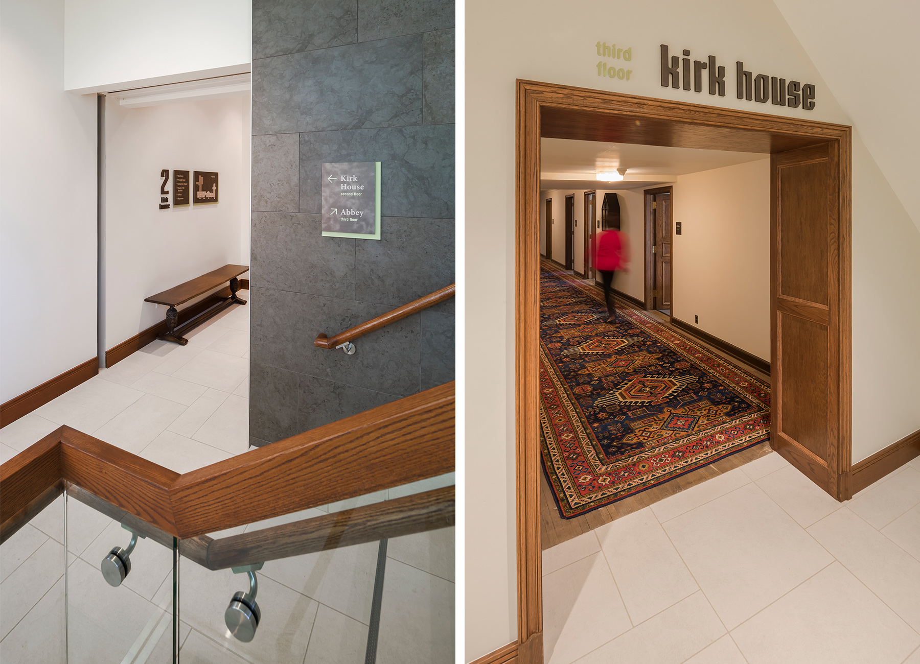
A combination of strategically placed directional signs, floor directories and area identification signs resolved navigational uncertainty. Photos © 2017 Gene Meadows.
LETTING ARCHITECTURE LEAD
When performing our initial Experience Audit of the interior, the Ideation design team made several observations that would influence the final design of the wayfinding signage. One of these was the significant role architecture was already playing in shaping the guest experience.
There were several areas such as the entrance to the original chapel and the Tower of the Apostles that needed to be treated very respectfully. The architecture—comprised of marble, stone, leaded glass and stained glass—shaped the experience. While signage was needed, it must not detract from the existing architectural beauty.
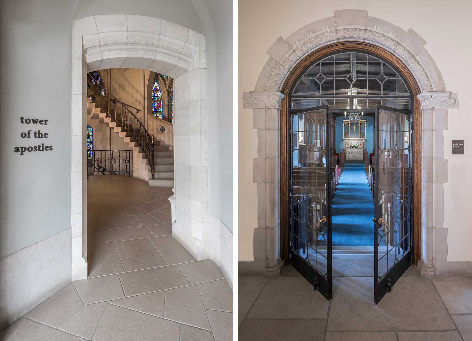
The entrance to Kirk in the Hills’ iconic Tower of the Apostles was identified with bronze letters while the entrance to the original chapel was marked with a more appropriate plaque style sign. Photos © 2017 Gene Meadows.
BALANCING THE OLD AND NEW
The Ideation design team also recognized that there was clearly both an “old” and “newer” look inside the church. While much of the interior had the original 13th Century gothic style, more recently added spaces had a more modern feel. Our wayfinding sign designs would need to traverse both of these styles gracefully.
We accomplished this by defining a collection of materials, colors, and finishes that would work well in both the traditional and newer spaces. From these materials, we designed 22 different sign types. We then created a simpler variation of the sign types for the older or more traditional spaces. Typography was used consistently across both old and new spaces.
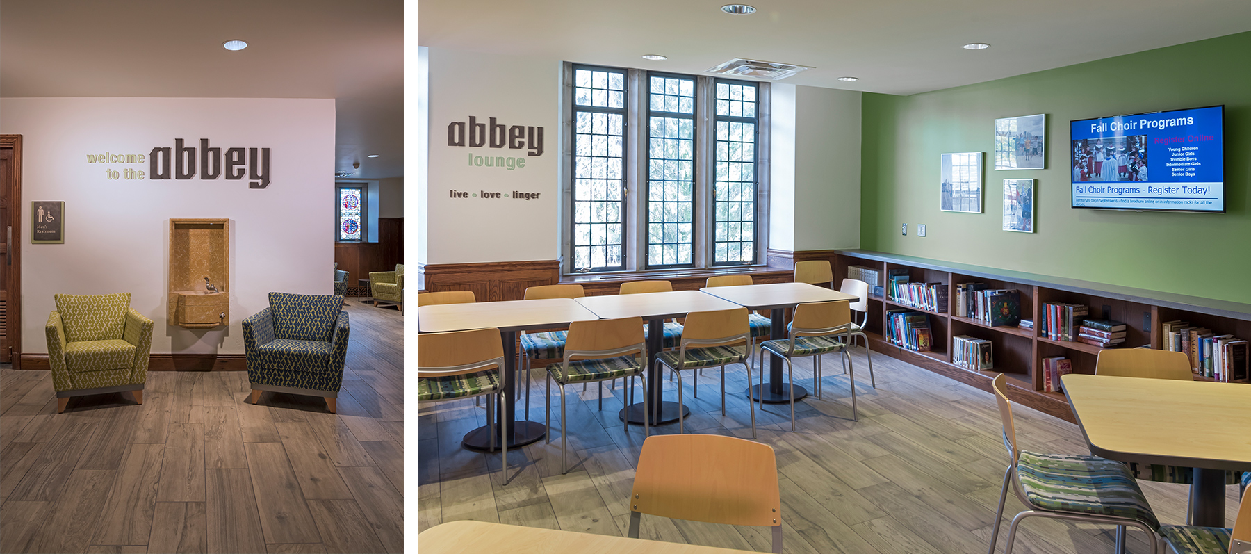
New Abbey lounge invites guests and members to live, love and linger. Photos © 2017 Gene Meadows.
DESIGN FOR APPROACHABILITY
The recently updated spaces, such as the new Abbey lounge, were designed to create a more informal and communal environment. While the new signage throughout the church needed to respect its surrounding architecture, reduced formality was also a goal.
In the spirit of this, lower case lettering was used in all signs except when referring to “Kirk in the Hills.” The message, Live, Love, Linger was added using dimensional letters in the Abbey lounge.
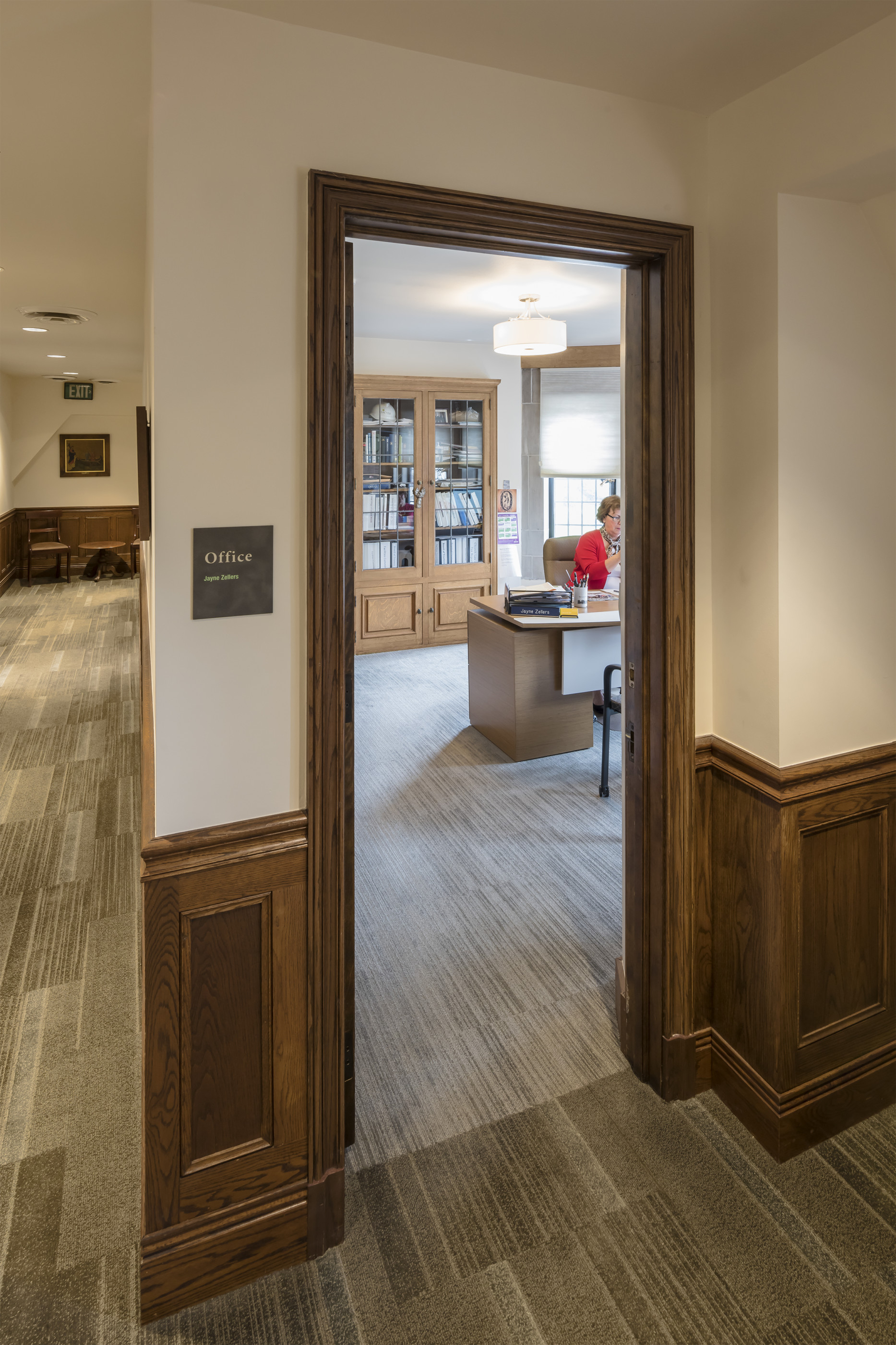
Room identification signs for the administrative offices. Photo © 2017 Gene Meadows.
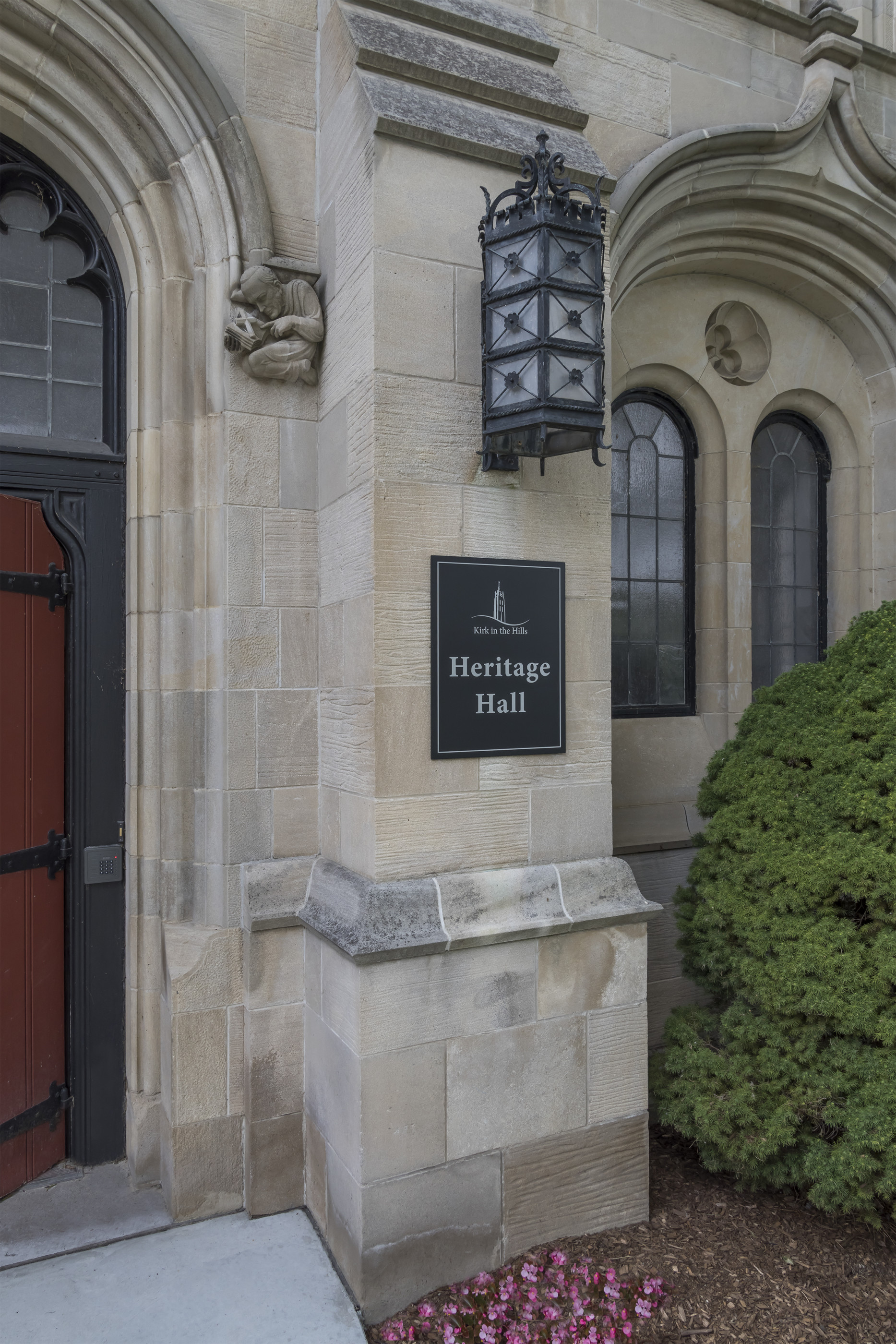
Exterior entrance identification signs produced from cast aluminum plaques. Photo © 2017 Gene Meadows.
SUMMARY
The final solution was comprised of 200 unique signs produced from 22 different sign types. According to lead designer, Michael Garavaglia, “It was thrilling to work with such a significant architectural landmark in the community. Our goal was to come up with a solution that respected both the architectural heritage of the church and the forward momentum of the community inside it. It required a measured approach that was both systematic and flexible.”
If you need help bringing comfort and clarity to your space, we’d be happy to help. Contact us.