We turn spaces into brand experiences people love.
Industries
Work
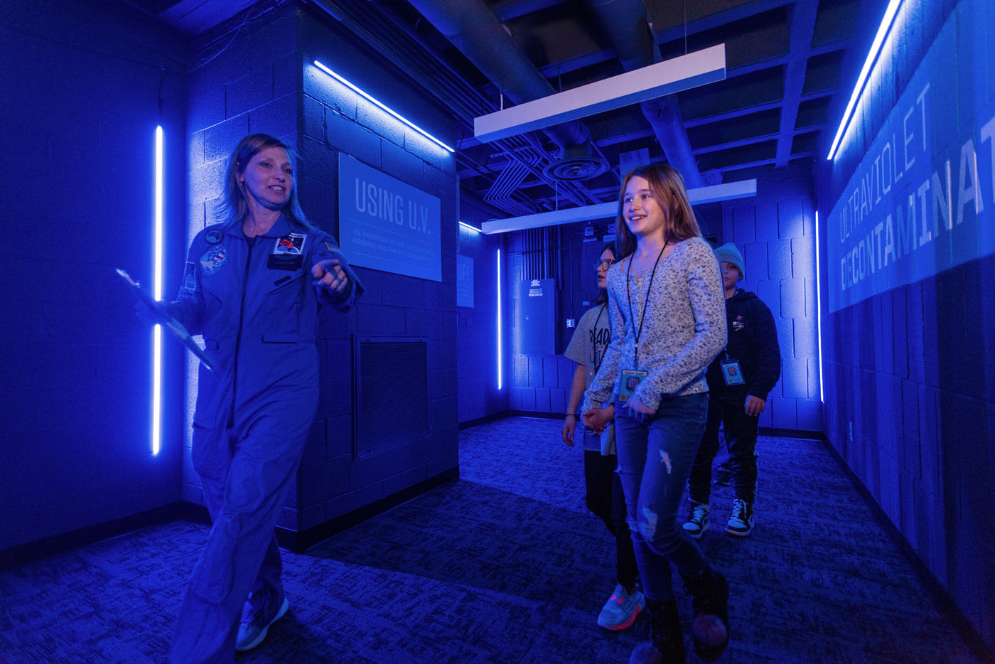
St. Clair Community College - NASA
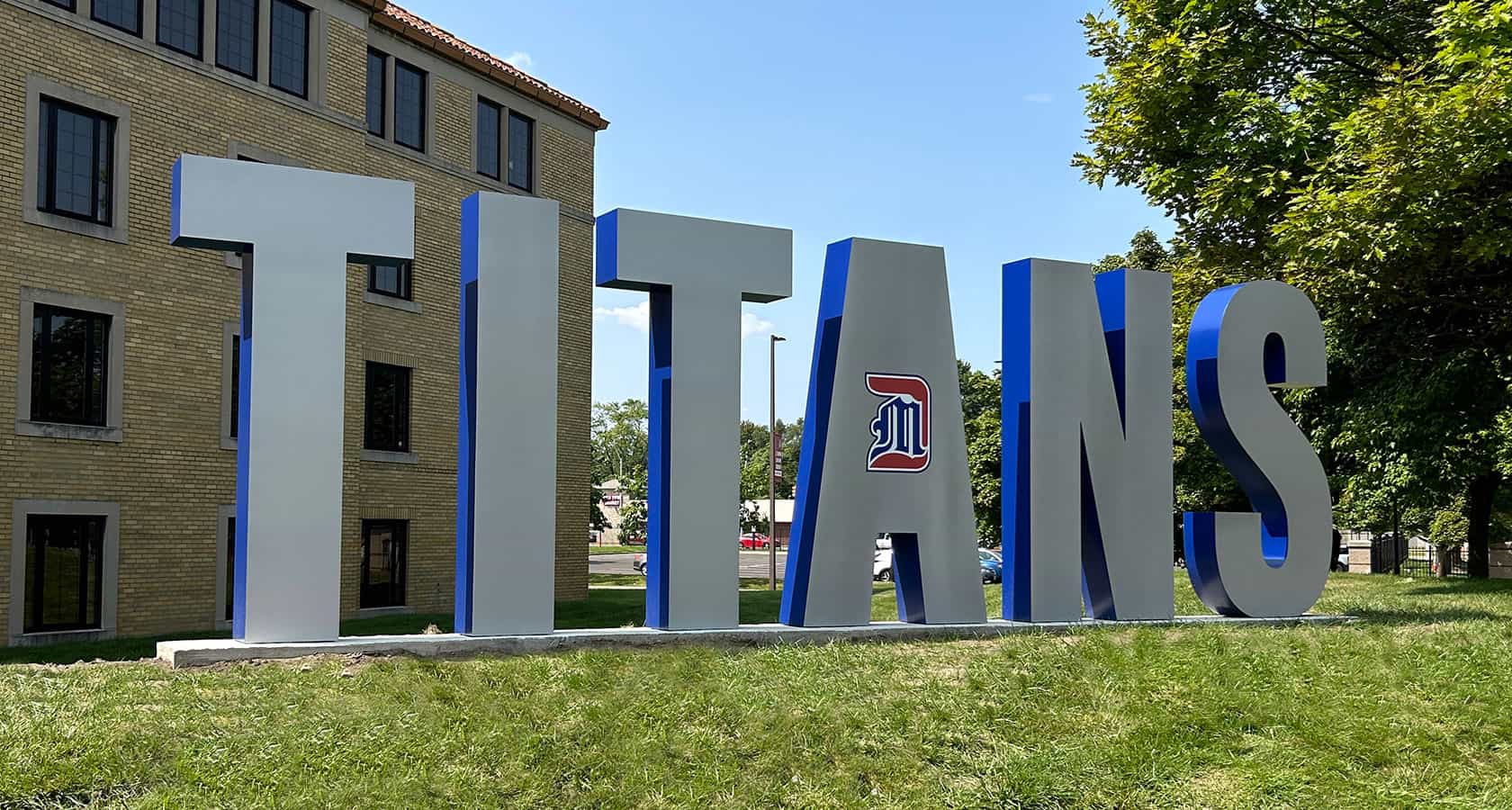
University of Detroit Mercy
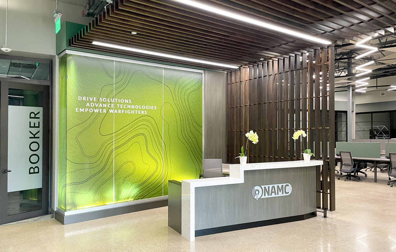
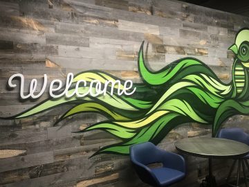
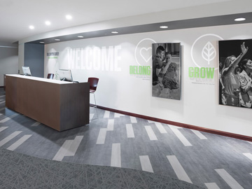
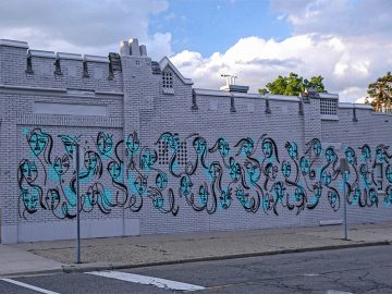
NAMC
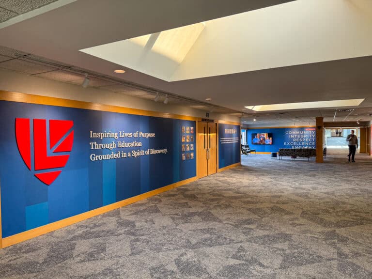
University Liggett School
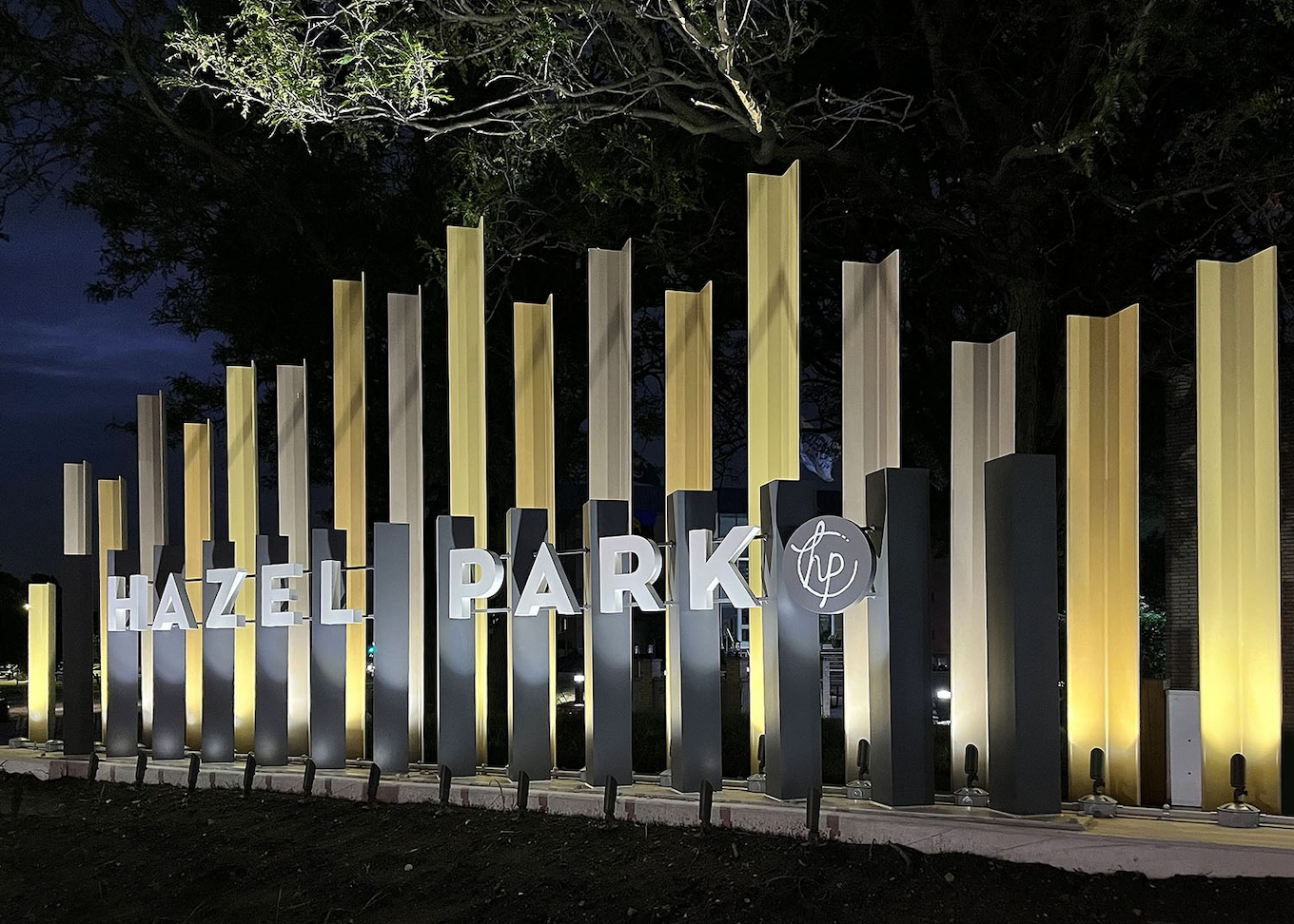
City of Hazel Park
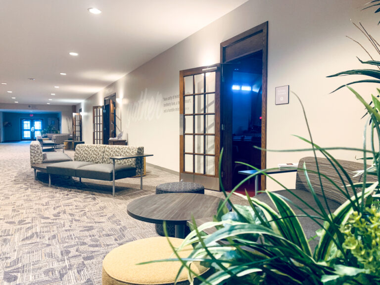
Hope Community Church
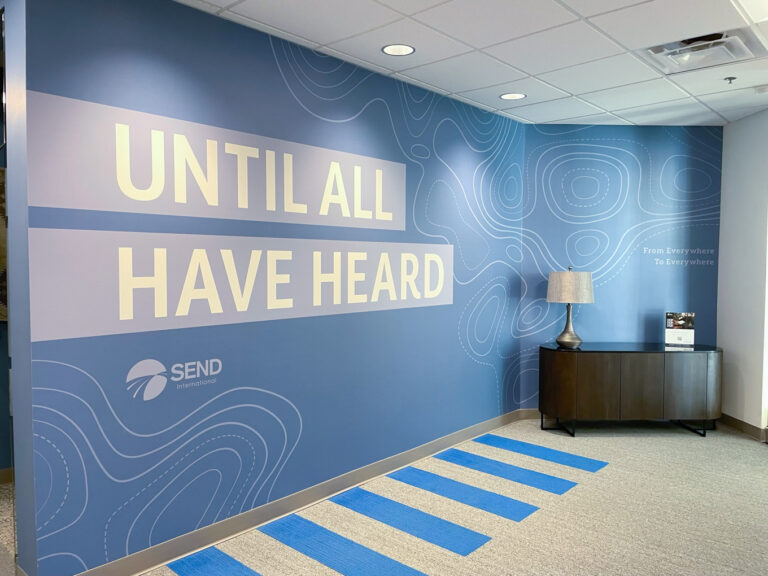
Send International
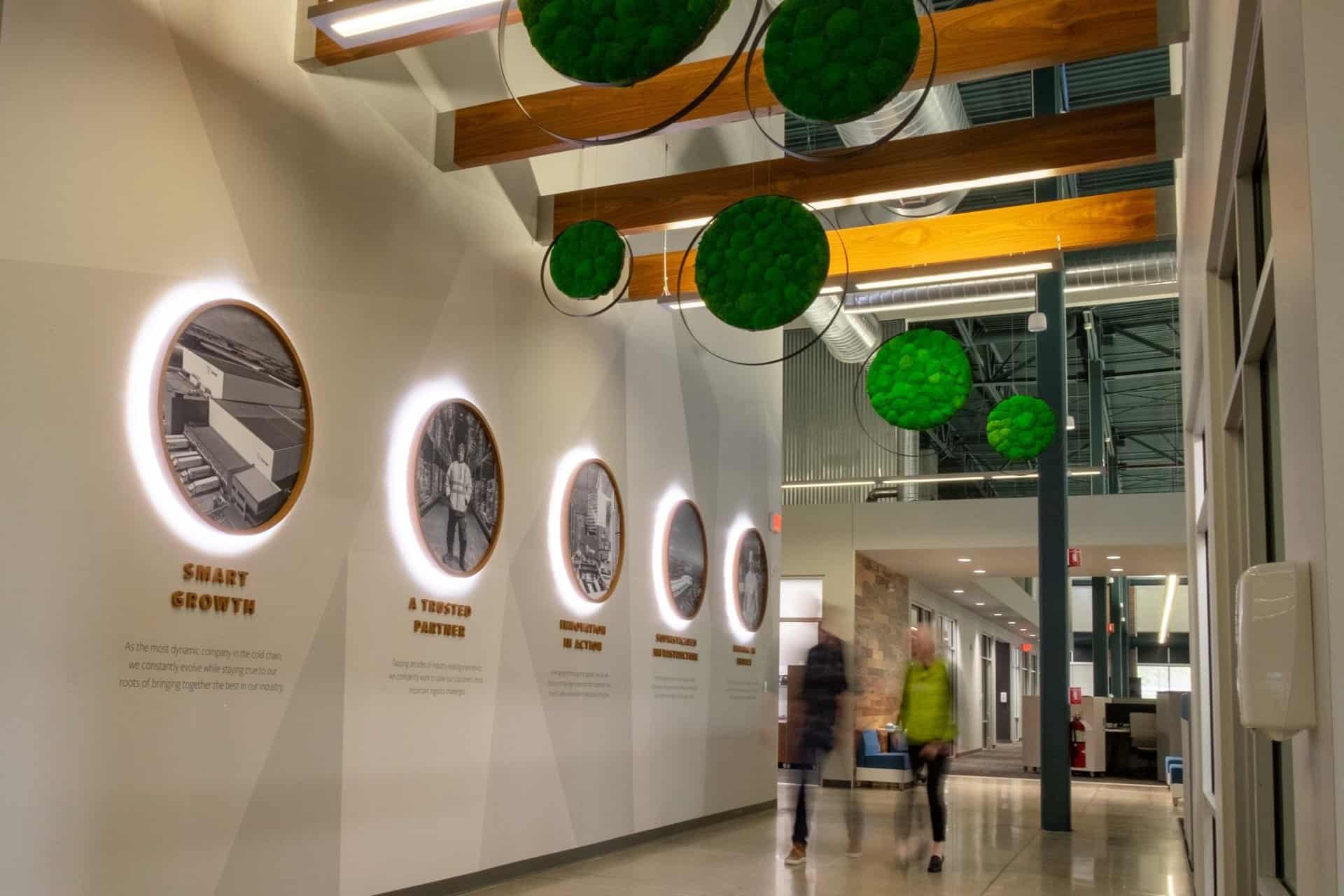
Lineage Logistics
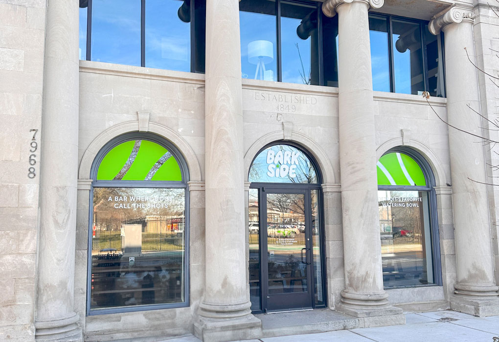
Barkside
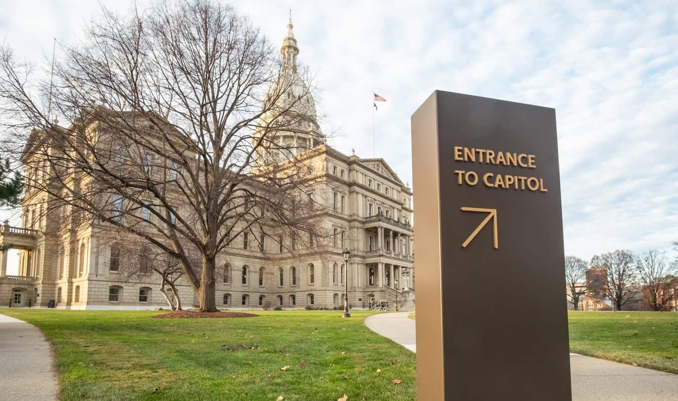
Michigan State Capitol
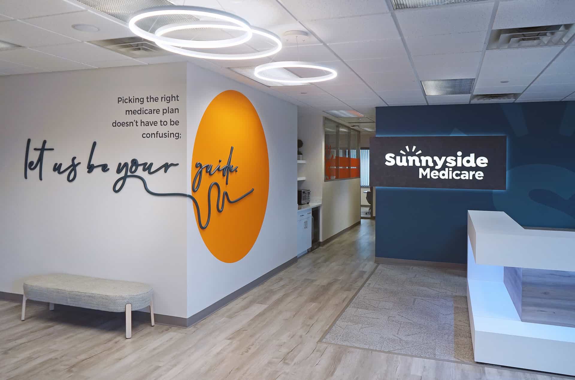
Sunnyside Medicare
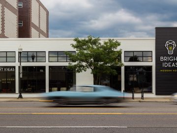
Bright Ideas Modern Furniture
The Roy
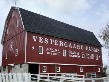
Vestergaard Farms
Strategic Energy Solutions, Exterior
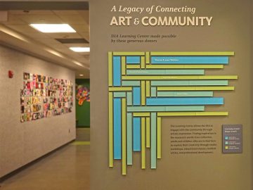
DIA, Learning Center Donor Display
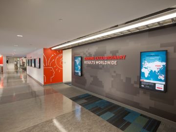
Strategic Energy Solutions, Reception
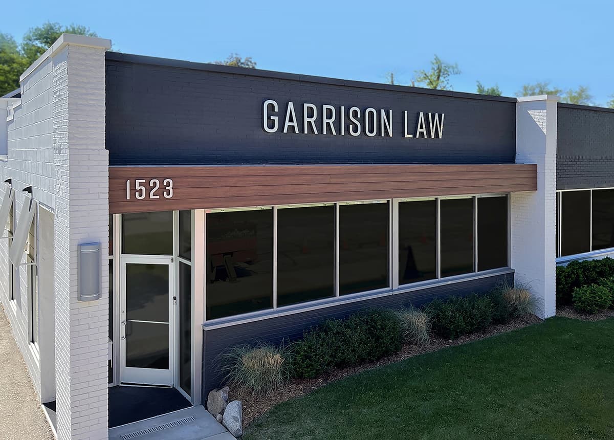
Garrison Law
Delta College
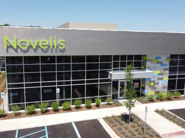
Novelis
Woodside Bible Church
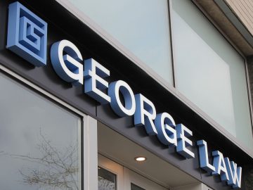
George Law
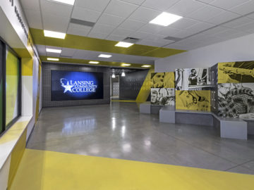
Lansing Community College
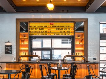
The Brakeman
David Pressley School of Cosmetology

Waltonwood Lake Boone
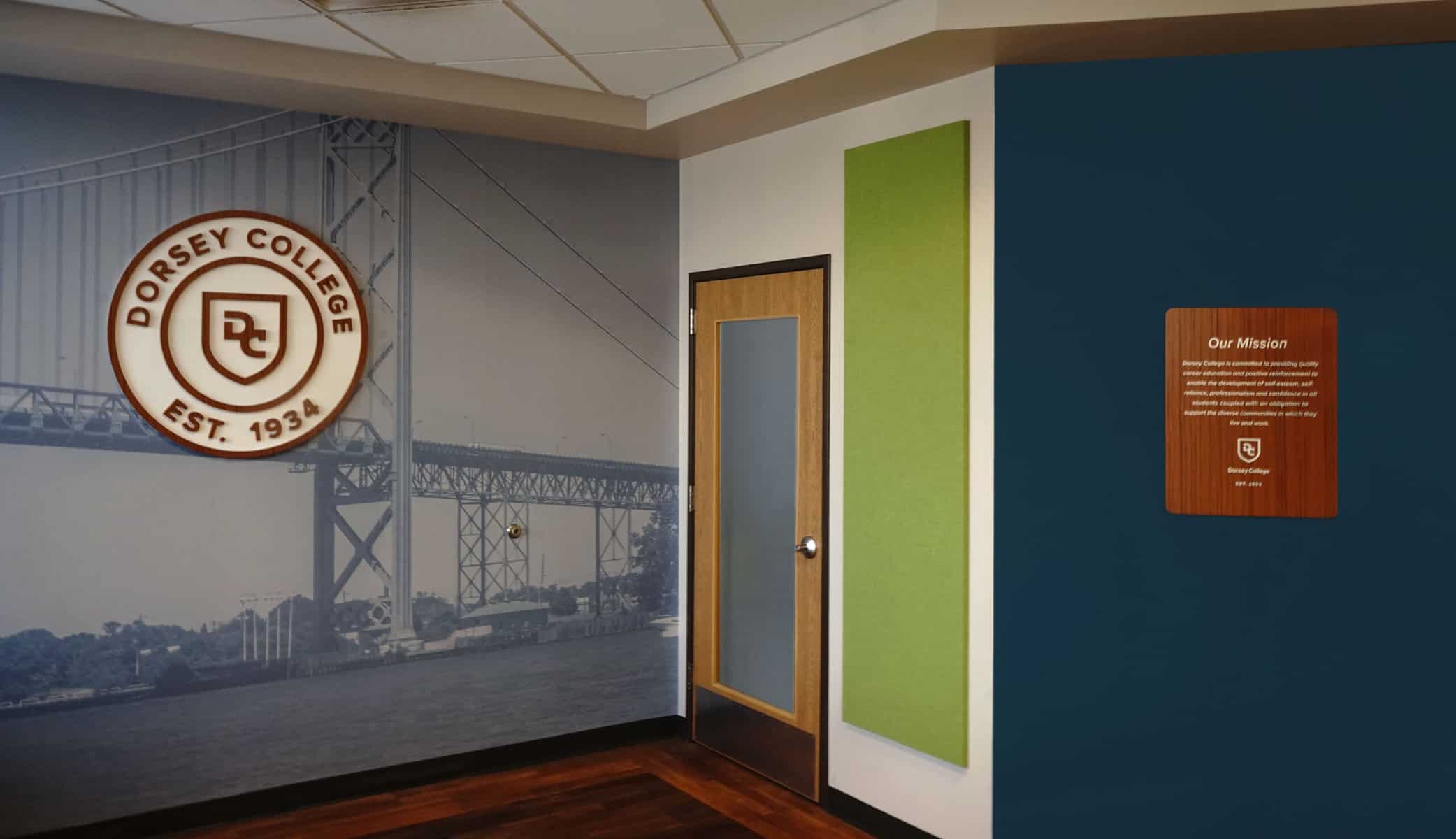
Dorsey College
White Wolf Japanese Patisserie
Kinetic Creations
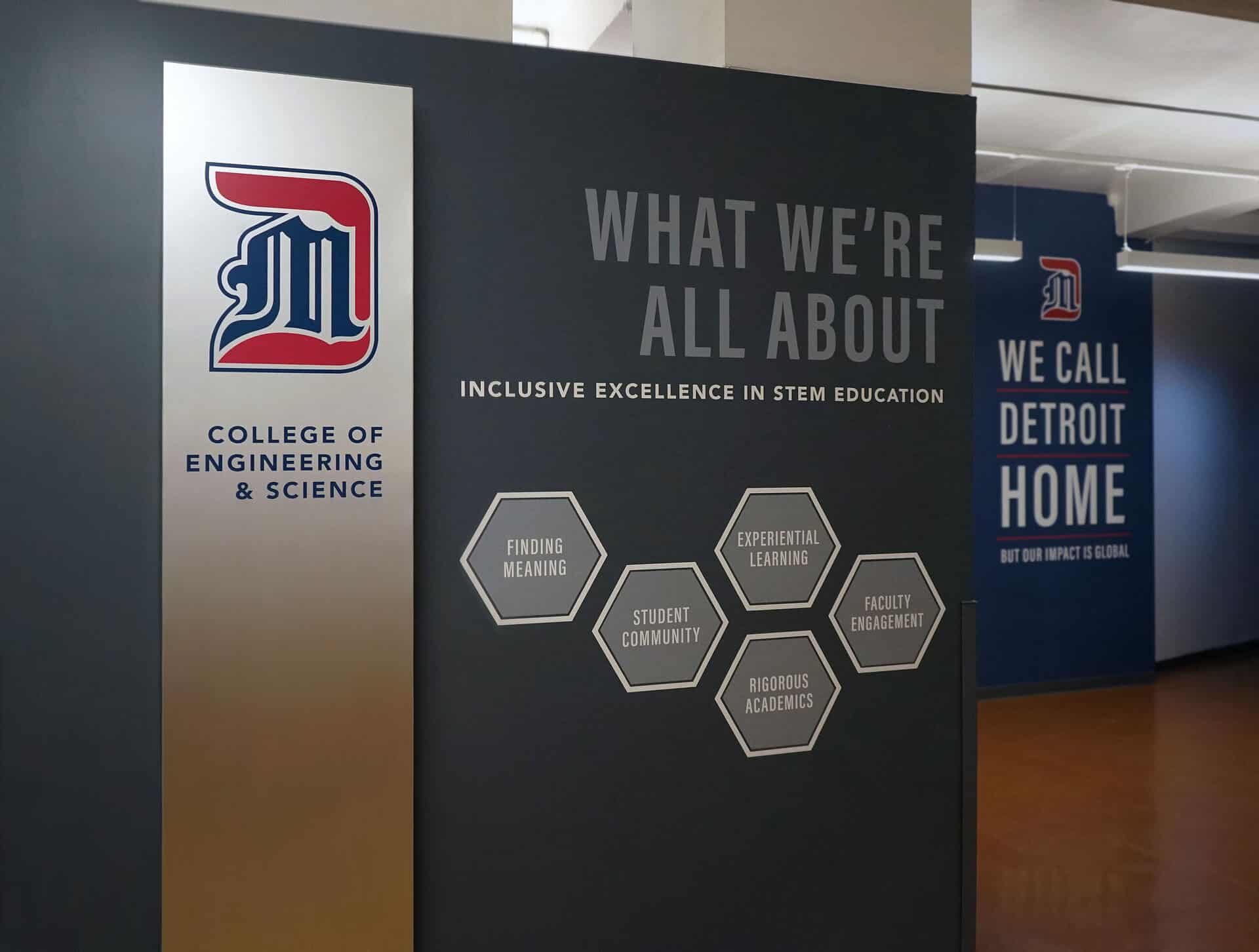
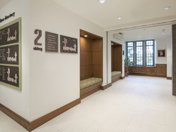
University of Detroit Mercy College of Engineering and Science
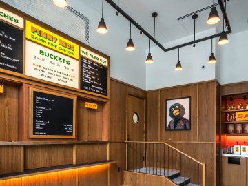
Penny Reds
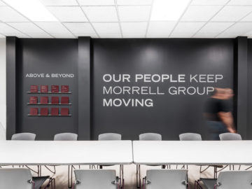
Morrell Group
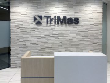
TriMas, Reception Sign
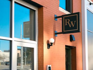
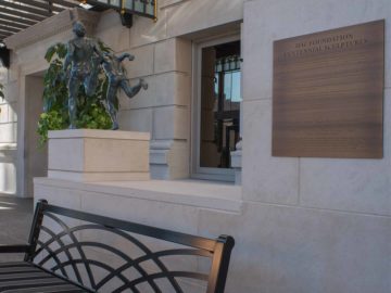
Ralph Wilson Foundation
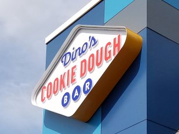
Dino's Cookie Dough Bar
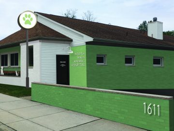
North Main Animal Hospital
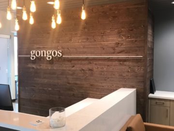
Gongos
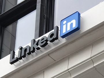
LinkedIn Detroit
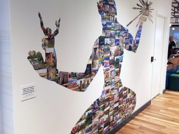
Accenture, Spirit of Detroit
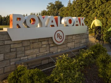
City of Royal Oak, Gateway Signs
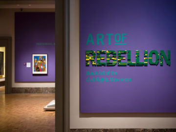
DIA Art of Rebellion Exhibit
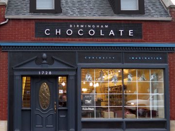
Birmingham Chocolate
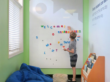
Brainspring
Kirk in the Hills
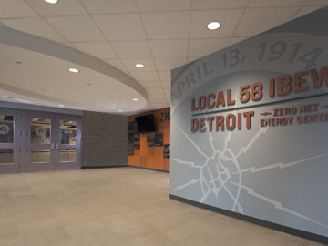
IBEW Local 58
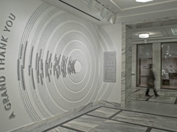
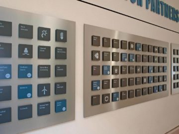
DIA, Grand Bargain Donor Display
Logicalis
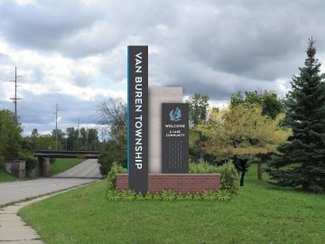
Van Buren Township Gateway Signage
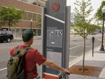
City of Royal Oak, Wayfinding Signs
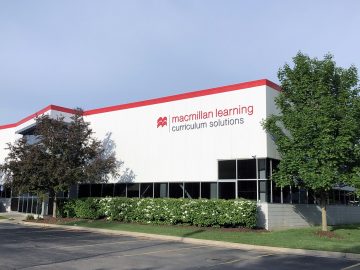
Macmillan Learning
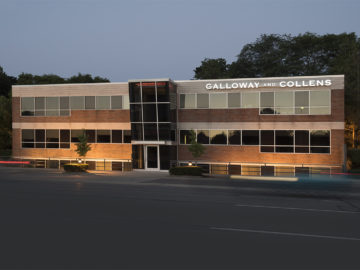
Galloway and Collens, Exterior Signs
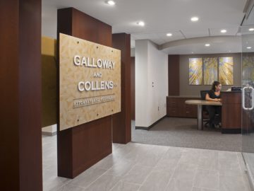
Galloway and Collens, Interior Environment
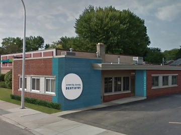
Serenity Family Dentistry, Building Exterior
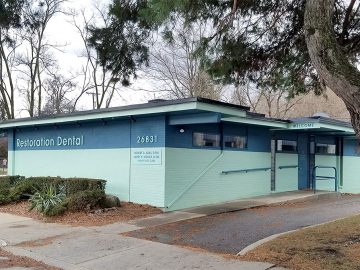
Restoration Dental, Building Exterior
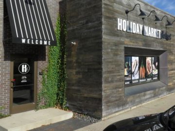
Holiday Market Select
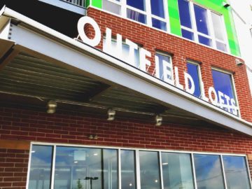
Outfield Ballpark Lofts, Lansing
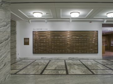
DIA, 21st Century Donor Display
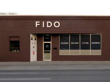
Fido
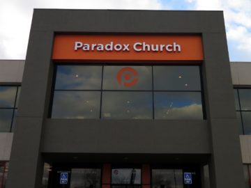
Paradox Church

Armstrong Sales Coaching

Detroit Athletic Club Wayfinding
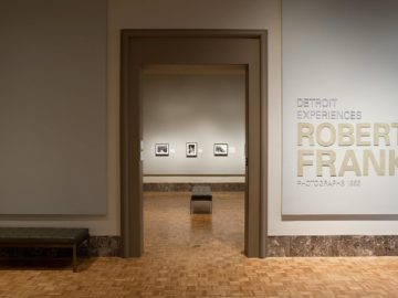
DIA Robert Frank Exhibit
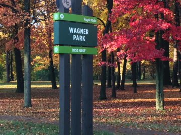
City of Royal Oak, Park Signs
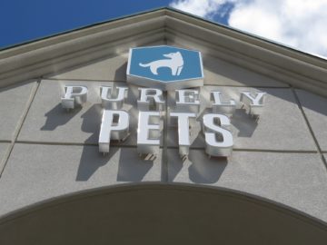
Purely Pets
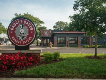
Bagger Dave's
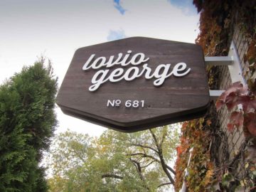
Lovio George
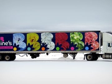
Bordine's
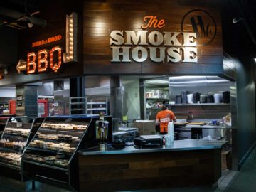
Holiday Market Smokehouse Branding
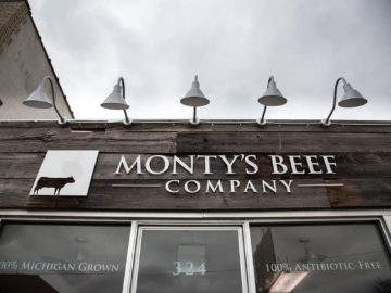
Monty's Beef
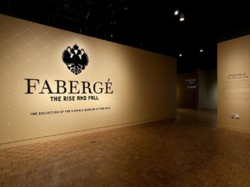
DIA Fabergé Exhibit
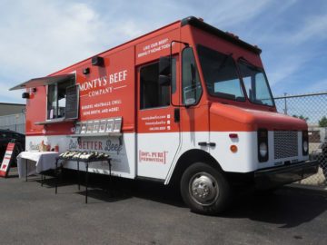
Monty's Beef Food Truck
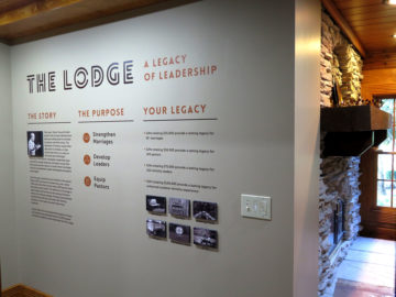
Woodside - The Lodge
Detroit Athletic Club Sculpture Plaques
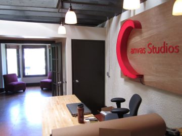
Canvas Studios
EITC Environmental Graphics
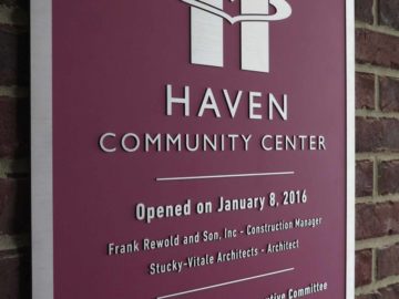
Haven
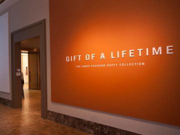
DIA Duffy Exhibit
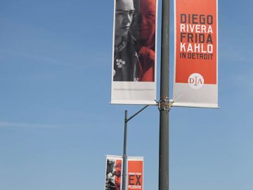
DIA Diego & Frida Exhibit
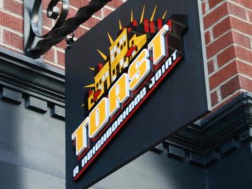
Toast
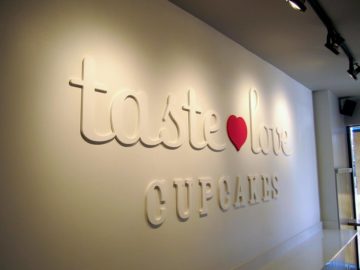
Taste Love Cupcakes
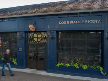
Cornwall Bakery
Midtown Apartments, Lansing
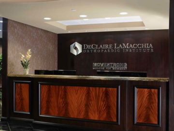
Declaire LaMacchia Orthopaedic Institute
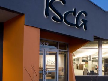
ISCG
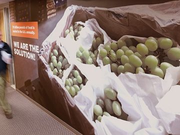
Forgotten Harvest
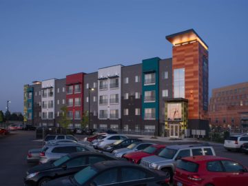
Marketplace Apartments, Lansing
Don’t let your space be common.
Create an environment that you and your people will be proud of.